BALLINA KEEP - New design on TC #53 on stone.

MissEMissE Posts: 782
edited May 2019 in Homes & Castles
Heyas, I am really happy with new keep design so am gonna post it on here.  It is basically an open space so that you can do your own internals as most of my builds tend to be.  This time I did put in porters (which I don't normally do) but did them the way I like them :).    Reason for the post is although the keep on the test is 'empty' I have done a couple of ground floor 'alternates' to show how you can change it.  Note that the 'deco' ones are very limited and just there to give ppl an idea of how versatile this open design can be. I think some people have difficulty 'imagining' spaces when they are totally open.  I only did the ground floor for the demo although the other floors may have the same treatment.  

Had nothing else to do today as it is raining and pretty miserable in Ballina where I live lol.  Anyways enjoy and if you like it vote for it. If not maybe get some ideas anyways. 

If you click on the pics 'twice' you will get the full size version which gives much better view of the build.

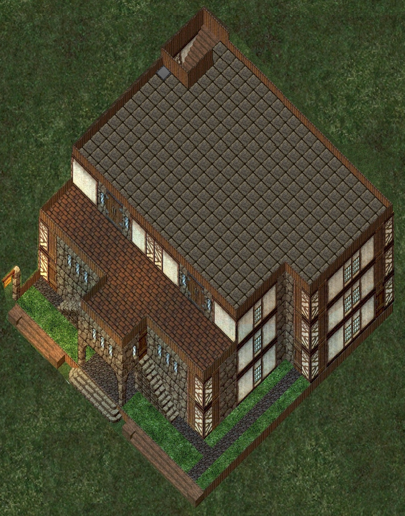
Roof View


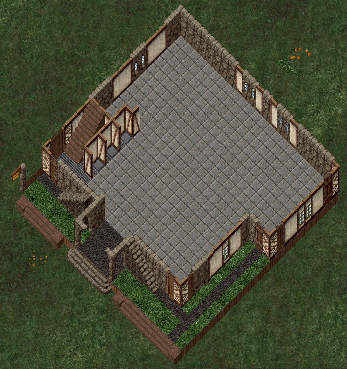
Ground Floor: the teleporters are under the grey goza, 2nd, 3rd, and roof in that order, there is a backdoor on the nth east corner.

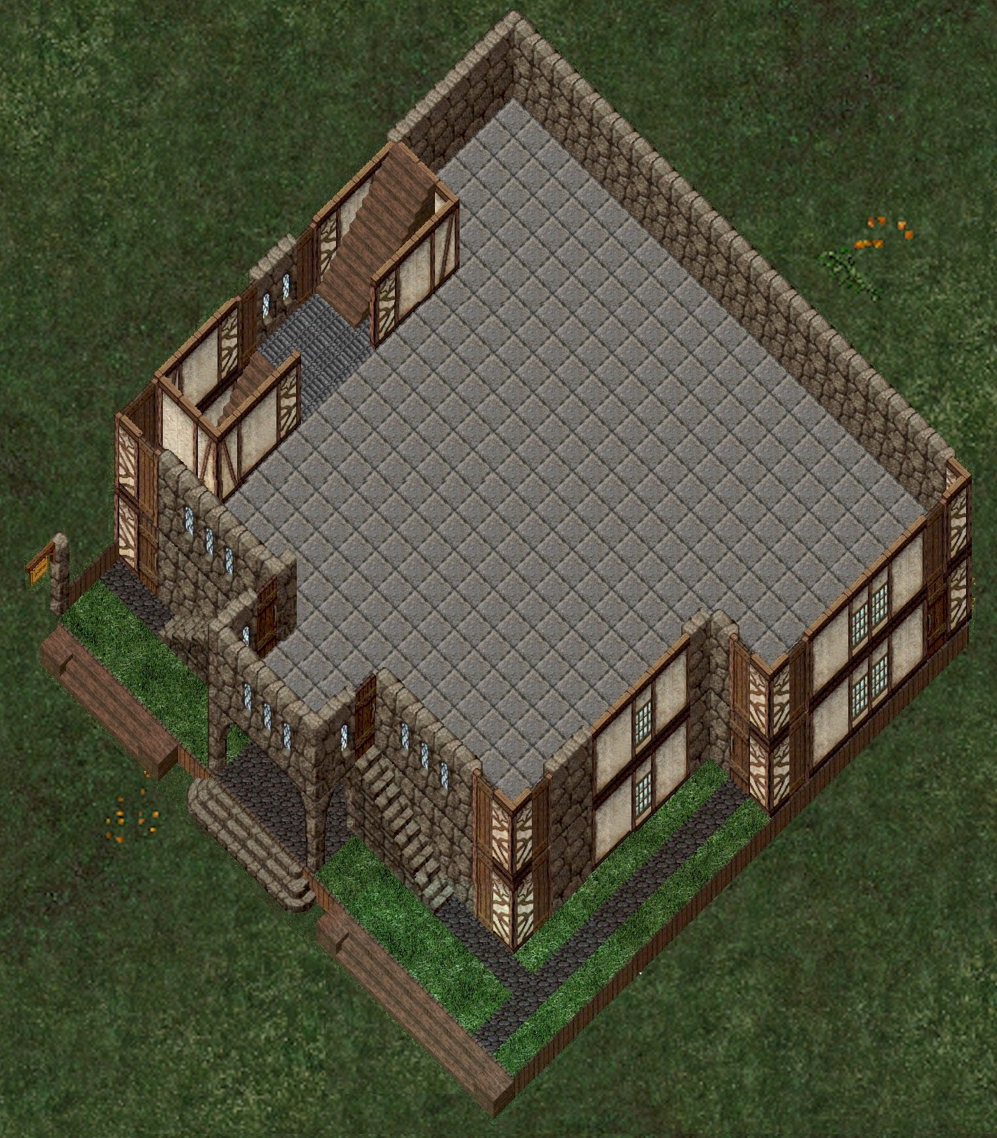
2nd Floor: You can access the floor from the internal stairway, the external stairways or the teleporter from the ground floor which is in the sth west corner behind the stairwell.
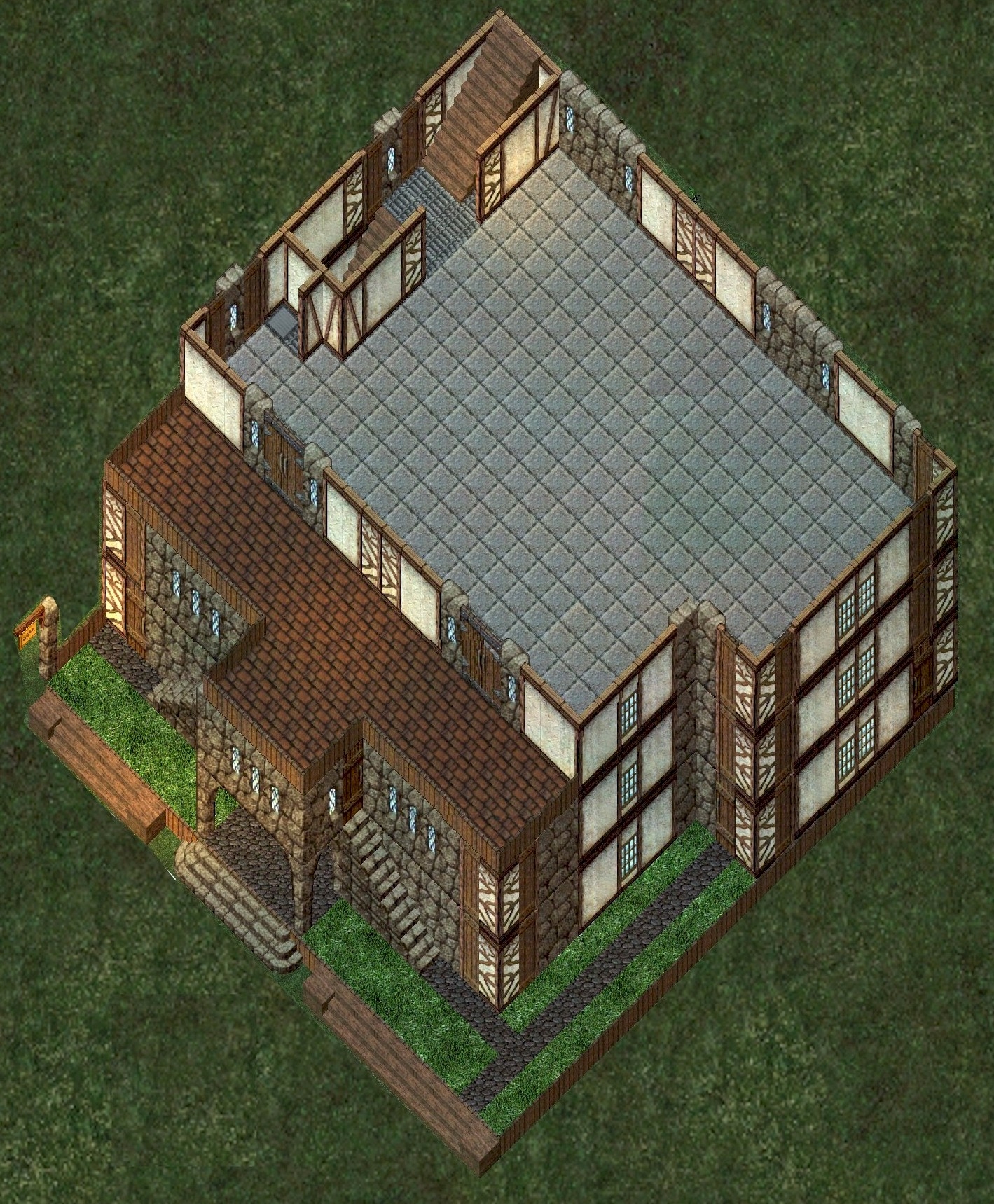
3rd Floor: Access to this floor is from the internal stairway and the teleporter from the ground floor.  It has an external patio as shown.
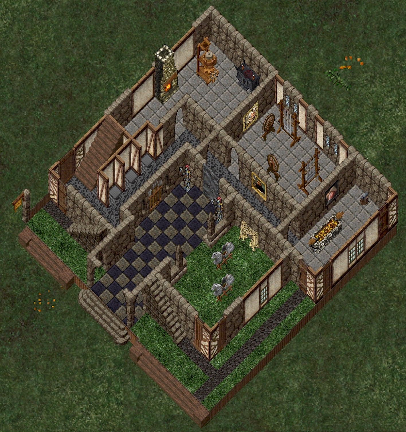
GROUND FLOOR ALTERNATIVES:


Ground floor alternate 1: 

This Ground floor has been set up orange stone walls just to highlight them but would most likely look better in grey.  I have put an arched doorway on the front only as the test centre wont let you put doors in due to no lockdowns allowed, but you can do either.  I didn't do any other deco other than put down some carpet as just wanted to show how stuff can 'tie' in. This is just basic walling which you can put where you like and is just simply rooms.
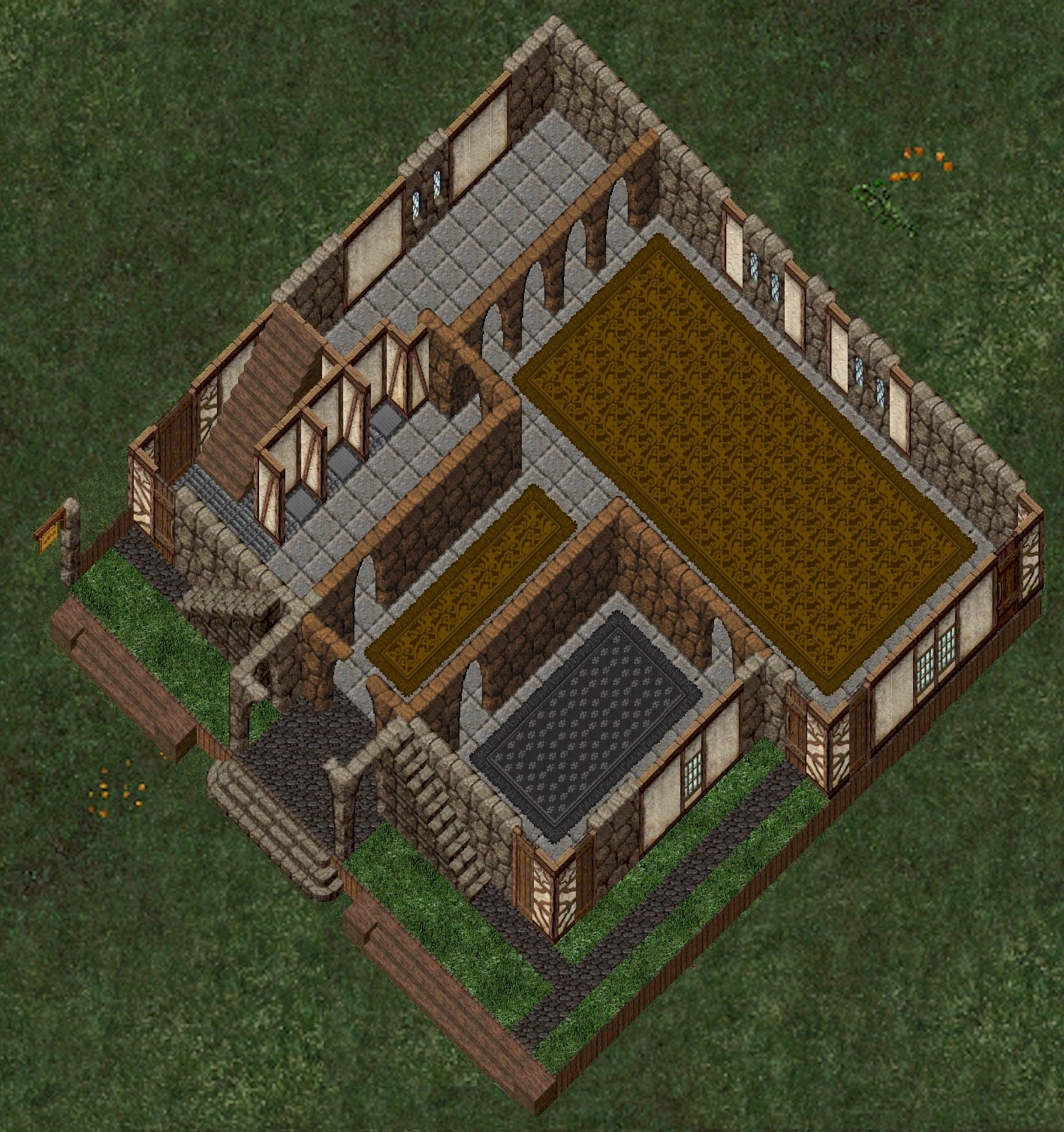
Ground Floor Alternate 2:

This one I added an internal front door, a stable area, and put some basic deco to suggest workrooms downstairs.  This design allows the placement of an oven where shown on this floor and you can add one the floor up if moved to the nth corner as well without it sticking through as the above stairwells disguise it. These walls I did in standard grey rock to show how they tie in.  Changed the entrance floor tile to a checkerboard and laid some grey carpet in the corridors.  I have goza over the teleporters but you can lay carpet over them too to blend in if you like.

Anyways these are just some idea on this particular build.  If I muck around with any more I will post em later. 

I don't have a big guild (well it consists of me) and only 3 accounts so no idea whether this build will make it into the top 20.

I just hope that people seeing this will perhaps look to making more open designs in the future as a lot the ones currently on offer are so specific people are not giving players option to customise.


Cheers MissE

For more info about Angelwood Warehouse Events go to the A.W.E Forum

Comments

  • ArronArron Posts: 485
    Great Job. You must have been doing this for a while now. You experience shows. I did my first keep and I don't think i can win but if I mad it to the second round I will be pleased. Just so you know yours  was one of the few that a gave a 3 rating, which is the highest for me so far. Yours is one of like 7 keeps that I gave such a high rating. By the way mine is #55 located on Ice Island.
  • MissEMissE Posts: 782
    @Arron Aye well sadly the first round of voting tends to go to those who have a lot of accounts, a big guild or a lot of friends in game.  When you have 80+ people all voting for their own build in the first round the vote gets super diluted.  It isn't until the second round that you get a better indication of likes once ppl are forced to pick from a short list.  

    Last Keep round I did three builds and none got into the top 20 although I think they were a lot better than some that did.  They are shown in that linked thread if you want a look. 

    That is just the way it goes so don't be too disappointed if  you don't get in. I am not banking on getting in.  I like building so will always enter and on rainy days like today I don't have much else to do lol.  Thanks for your comments, I will check yours out later :)

    Cheers MissE

    For more info about Angelwood Warehouse Events go to the A.W.E Forum
  • ArronArron Posts: 485
    Very good designs. You are quite talented. I hope you keeps make it to the second round.
  • MissEMissE Posts: 782
    Well it made it to top 20 but who knows from now on. 

    @Arron i checked out your keep, and my main comment (and only my opinion :)) for next time would be to reduce the amount of different wall/floor tiles  you use in the same build.  The structure was fine, but in my view you need to cut down the color choices and tile choices as I guess it was a little 'busy' for most peoples taste.  I try to visualize what people are gonna do with all their 'stuff' and how it will fit into the overall build, so tend to be more minimalist when it comes to colors/patterns.  The more patterns you put the more polarizing it is as people either love or hate a particular tile set.  It also becomes more difficult to do a deco theme if the floors/walls are heavily patterned or colored.  Great effort though!  Also, as another tip, go and check the castles and keeps that have 'won' in the past and check how the majority are very simple in their tile choices. 

    That being said, my builds tend to be overly simple as I prefer to 'customise' the shell, as I did up there.   Other people like to have the building really complicated which some people like. 

    Personally I don't like the complicated builds, they may 'look' great as a building but to actually 'live' in they are problematic, with too many small rooms, turrets, walkways, pathways etc etc that make placing stuff difficult.  I mean for me, some in the top 20 are excellent builds and from the outside look really nice, but when I walk into them I am thinking, ok where can I put a soulforge, and how are all the crafting benches gonna fit in here, and if I want a guild room to seat a few people is there a room big enough etc etc.   Most of the complicated builds won't allow me to do that, nor allow me to redesign as we get a new item, especially if that one item is 4x4 tiles etc.  Ie very few of the complicated builds will let you place a large koi pond for example that needs a huge flat area. 

    But to each their own.  It is the fun you have designing and building that is what matters so keep at it. 

    Cheers MissE

    For more info about Angelwood Warehouse Events go to the A.W.E Forum
  • VioletViolet Posts: 408
    I liked this keep, but I always enjoy Miss Echos work.  She always includes thoughtful design elements.
  • ArronArron Posts: 485
    Thank you for the great critique. I will keep it all in mind for the next time. Thank you for the encouragement @Violet


  • MissEMissE Posts: 782
    Arron said:
    Thank you for the great critique. I will keep it all in mind for the next time. Thank you for the encouragement @ Violet


    Aye well don't give up.  Ya just got to KEEP and CASTLE at it!  :)

    Cheers MissE

    For more info about Angelwood Warehouse Events go to the A.W.E Forum
Sign In or Register to comment.